We reviewed a lot of the clothes-less characters in our last Smash Bros. Fashion Panel, so this time it’s nice to have some more “fashion” to dive into. Yes, fashion includes a tongue-scarf in this scenario.
This week: some animals that actually wear clothes, and Ike.

Fox, Greninja, Ike, King Dedede, Kirby

Jillian
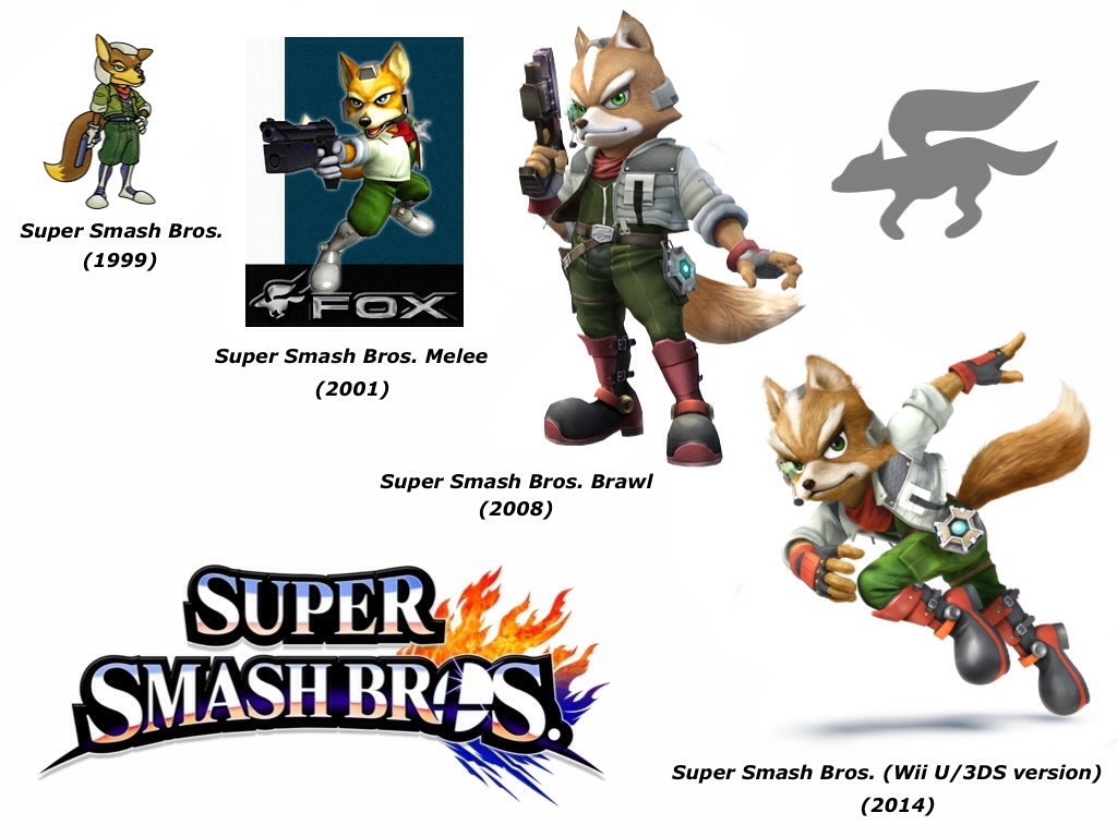
Fox’s face changes shape every year and it looks like he’s adopted brown contact lenses this time around. He’s got this half-terrified, half “wah-waaah” look in his portraits that isn’t really befitting a star-travelling, universe-saving anthropomorphic fox. Clothing-wise, I like most of his color combos, although I prefer him with the traditional rusty red fur to help differentiate from Wolf. He looks especially good in #5, the salmon shirt with blue scarf, which is giving off a bit of a Nathan Drake vibe with those dark khakis.
Joey
First a disclaimer: After years of being beat into the ground by pro Fox players, I’ve grown an aversion to his stupid smug face. In fact, his profile picture in this game looks more smuggy than ever before and I want to play Smash Bros. right now just to beat on him. I agree with Jillian that the red fur is a must. Dead Daddy Fox would be spinning in his space grave if he saw his son adventuring looking like Star Wolf. None of the red fur options have a color scheme that scream “star ship pilot,” but #3 whispers “I guess I could be worn in space.” So that’s my pick. Random aside: did you know that the Star Fox characters are known in the Smash Bros. community as the “Space Animals”?

Jillian
I had to look up other pictures of Greninja to figure out that that scarf is actually his tongue, which is freaking me out. One, because gross. Two, because it’s changing color on each of his palette swaps and I’m really concerned about the liver health of numbers 5, 6, and 7. This guy is just bizarre to look at and has way more of a robotic Digimon or Gundam vibe than a frog-Pokémon. If I were forced to play as him, I guess the yellow and black #4 is the least visually offensive. But what’s with the giant shiny opals stuck in his overly muscular joint sockets? And why the bat-like ears? Okay, honestly, I can’t get past the tongue, but this is to just to say, he’s a total mess.
Joey
Usually I’m a sucker for scarves, but I draw the line at scarves made of your own body parts. This guy is almost single-handedly keeping me from playing the new Pokémon. I prefer them cute and cuddly. Not weird and confusing. Jillian has already commented on all the upsetting things involved in his appearance. Really, I dislike them all but #6 is most similar to an actual frog so I’ll go with that one.

Jillian
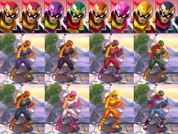
I’ve only played one Fire Emblem game and Ike wasn’t in it, so there may be a canon reason for this–but with all these different colors, I wish his sword changed appearance, too. The gold works well in some instances (#5) and less in others (#8). His boots also have this really weird shape and gloss that make his feet look like they were copy-pasted from an N64 game. His headband/crown/sweatwrap is so dark in every palette that it might as well just be a braid of hair. Color-wise, I like him best in dark, non-shiny pants, so #s 3, 6, or 8 are the only acceptable variations.
Joey
Yay! Actual humans! Ike’s whole deal is that he’s supposed to be a gruff and tough mercenary-turned-hero. So I think a less royal color scheme works best in order to differentiate him from Marth. It’s a bit of a toss up between #1 and #3 for me. Some of the others (like #8 and #6) look okay, but they’re not a good fit for Ike. #5 isn’t a good fit for anyone.

Jillian
King Dedede is the first character whose variations are actually interesting–the cloth pattern on his cummerbund changes with each color swap! Pattern-wise, I think something lighter and more subtle works with his, uh, figure. Wide stripes and checkers are just accentuating the fact that he spends most of his time in gourmet food races. #s 2 and 4 are figure-flattering, although I do love that #3 proves he has a Kirby cummerbund in his closet. For colors, I like the penguin-esque arctic look of #s 5 and 7, but since he is a “King,” he looks most comfortable and regal in #4’s royal purple, whose pink gloves are surprisingly not infuriating. Side note: his portrait is adorable and very “grade school picture day.”
Joey
Different patterns!? My god, Nintendo. You’ve really outdone yourselves this time. I’m not sure if King Dedede is supposed to be menacing or silly. Personally, he kind of terrifies me. If a fat penguin was chasing me with a giant hammer I’d probably wet myself. As mentioned before, I like my animals with more natural skin tones, so my pick is #8. The purple sweater makes him a little less intimidating, but I just can’t approve of a sky blue penguin.

Jillian
After, what, 16,000 games?, it’s hard to picture Kirby as anything but the pink puff ball, unless you’re often relegated to Player 2 position. I really like #6, black-and-white GameBoy Kirby, but am terrified of #8, soulless eyes rotted jack-o-lantern Kirby. And while I know Kirby is something of a blank canvas on which adorable costumes and items are bestowed when you inhale someone, it still would have been nice to see more color variation here: stripes or polka-dots, at least. Favorite little touch: his cheek blush changes color with the rest of him. (Another reason #8 is so creepy: no adorable blush.)
Joey
Okay, obviously #1 is the best. Pink fluff balls should remain pink fluff balls. Kirby is going for maximum cute, so #3 also kind of works. The others evoke too much non-cute emotion. #4 has an angry (or too much hot sauce) vibe, #5 has a sickly (or too much rotten food) vibe, and #8 has an evil (or too much bowling ball) vibe. I think at some point we’ll have to get a gallery of Kirby with all his hats so we can discuss them.


